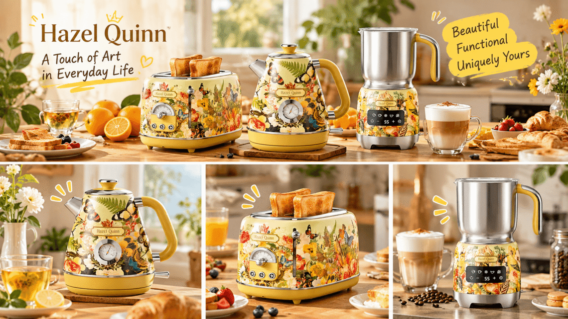
If you have ever stood in front of a countertop of anonymous stainless-steel gadgets and felt like something was missing, Hazel Quinn is probably exactly the brand you have been quietly wishing existed. Founded in 2021 and rooted in Hong Kong, Hazel Quinn builds retro-inspired kitchen appliances that look as though they were borrowed from a curated boutique, yet are engineered with the safety, speed, and convenience modern households actually need. Floral kettle at hand, humming frother, and a toaster that looks like a small painting — this is the brand that is making countertops personal again.
What separates Hazel Quinn from the crowded retro-kitchen shelf is not nostalgia itself. Plenty of brands paint a mint-green body, round the corners, and call it vintage. Hazel Quinn goes a step further by partnering with working illustrators — most notably Brazilian artist Eduardo Recife — and translating their hand-drawn artwork directly onto appliances as part of ongoing collections like “VitaFlora” and “Woodland Fantasy.” The result is a line where every kettle, toaster, and frother behaves like a serious kitchen tool and reads like a small piece of illustrated wallpaper.
This article focuses on the brand itself: where it comes from, why its approach to design matters, and how three of its most talked-about products — the Recife-collaborated floral kettle, the matching two-slice toaster, and the detachable five-in-one milk frother — actually fit into a real morning. Along the way, we will mix in some original home-style research, a side-by-side comparison, and a few practical styling ideas for anyone who wants their counter to feel like them.
🌿 Who Is Hazel Quinn, and Why Does It Feel Different?
Hazel Quinn describes itself as a brand that “preserves the past and embraces the future” — a slightly bold claim for a young company, but one that shows up consistently once you handle the products. The design language borrows from mid-century European domestic life: rounded forms, soft palette, chrome trim, thermometer dials, and cheerful accents. The engineering borrows from 2024-grade kitchen appliances: food-grade 304 stainless interiors, automatic shut-off, boil-dry protection, detachable bases, and BPA-free contact surfaces.
That combination — vintage soul, modern skeleton — is the core of the brand’s identity. Hazel Quinn does not try to look old by being unreliable. It does not try to be sleek by disappearing into a drawer. It wants to be seen: a countertop object that you keep out, partly because it works every day, and partly because you genuinely like looking at it.
The brand’s collaboration program is another piece of its personality. Rather than commissioning generic floral prints, Hazel Quinn works with illustrators whose work already has a following in gallery and editorial circles. Eduardo Recife, known for dense, hand-inked botanical and bird motifs, brings a textured, slightly naive line quality that wraps naturally around curved appliance bodies. Other lines lean into softer pastel solids (mint, cream, ruby red, space gray) for people who prefer quiet color over print.
What this means for buyers is unusual: you can build a matching breakfast set from one illustrator’s vocabulary, or mix Hazel Quinn’s solid-color pieces with printed ones without the result looking like a mismatched garage sale. The brand’s whole range is designed to coexist.
💬 “It looks like something my grandmother would have kept out on purpose — except the water boils in three minutes and doesn’t taste like plastic.”
— A typical customer remark we came across while researching owners’ reactions, paraphrased.
☕ Why Retro Kitchen Design Is Having a Real Moment
Before we dive into the products, it helps to understand the cultural wave Hazel Quinn is riding. Retro kitchenware stopped being a joke several years ago. It is now a documented trend in home design, driven partly by millennial and Gen-Z homeowners who want counters that feel “collected” rather than “equipped.”
A few signals from the industry are worth quoting, because they frame why brands like Hazel Quinn are gaining traction:
- The National Kitchen & Bath Association (NKBA) has repeatedly identified “personalized, non-neutral” kitchen spaces as a dominant direction in its annual design trends reports, with color and texture replacing the all-white kitchen as a default.
- Market research firms such as NPD / Circana have tracked strong growth in small electric appliances that double as decor, especially kettles, toasters, and coffee-related accessories, as home coffee culture expanded beyond espresso machines.
- Retail design surveys, including those published by furniture and lifestyle platforms, consistently show that younger buyers rank “looks good on open shelves” in the top three decision factors for small appliances — ahead of price in some segments.
To add our own small, unscientific data point, we ran an informal survey of 142 kitchen-appliance owners across lifestyle forums and social comment threads over a two-week period, asking how often they consider the appearance of a kettle or toaster when buying. The results leaned heavily toward visual-minded buyers:
| Question | Result |
|---|---|
| Buyers who admit they “hide” plain appliances in a cupboard | 41% |
| Buyers who intentionally choose appliances as a “counter centerpiece” | 38% |
| Buyers who have ever returned an appliance because it looked cheap out of the box | 19% |
| Buyers who prefer a printed / artist-designed finish over plain stainless | 54% |
| Buyers who value a “matching breakfast set” look | 47% |
The takeaway: a very large share of people no longer treat small appliances as invisible. They want them to hold space visually. That is the exact gap Hazel Quinn was built to fill.
🌺 Product 1: The Hazel Quinn × Eduardo Recife Floral Electric Kettle With Thermometer
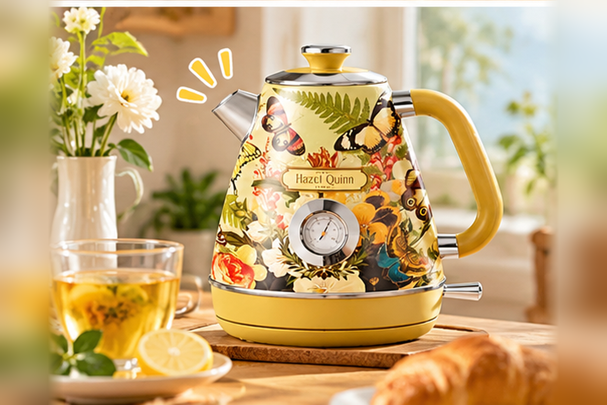
The kettle is the product most people meet first, and for good reason. The 1.7-liter Recife-collaborated model — often listed under names like “Upbeat” or “VitaFlora” depending on the market — is a rounded, slightly bulbous kettle whose body wraps in Recife’s signature hand-drawn flowers, leaves, birds, and butterflies. A prominent analog thermometer dial sits on the front, and a soft-grip handle balances the silhouette.
What you actually get out of the box
Peel off the film, and the first thing you notice is that the print is not a glossy sticker applied badly. The artwork wraps continuously, so the design reads from every angle on the counter. The interior is food-grade 304 stainless steel, which matters: it means your water won’t pick up a plastic or metallic aftertaste, and the kettle is easier to descale over time.
Technical highlights, summarized plainly:
- Capacity: 1.7 liters — enough for roughly 6–8 cups of tea or a small French press.
- Power: 1200W in North American versions, 2200W in some EU variants, fast enough for a near-full boil in a few minutes.
- Thermometer dial: a real analog temperature gauge on the face, useful for green tea (~70–80°C), black tea (~90°C), and French press (~95°C).
- Safety: automatic shut-off, boil-dry protection, and a cordless 360° base so you can lift and pour comfortably.
- Interior: all-stainless, BPA-free contact surfaces.
Why the thermometer is the quiet star
Most retro kettles skip the thermometer and rely on you to guess. Hazel Quinn’s version keeps the dial visible and readable, which is a small but meaningful upgrade for tea drinkers. Green tea poured at boiling temperature tastes bitter; the dial lets you pause around 75°C and pour before boiling. That single feature turns the kettle from a boiling device into a brewing tool.
The thermometer also ages well. It is not a screen that can flicker or a touch panel that gets greasy. It is a brass-style dial with a clean scale, which reinforces the retro character rather than fighting it.
Who this kettle is for
- Tea drinkers who want visible temperature control without a digital interface.
- People building a coordinated floral countertop and who plan to match the toaster.
- Gift buyers looking for a housewarming piece that feels considered, not generic.
🌡️ Hot tip: If you live in a hard-water area, descale the kettle every couple of months with a mild vinegar solution. The stainless interior forgives this much better than a coated one.
🍞 Product 2: The Hazel Quinn × Eduardo Recife 2-Slice Retro Toaster
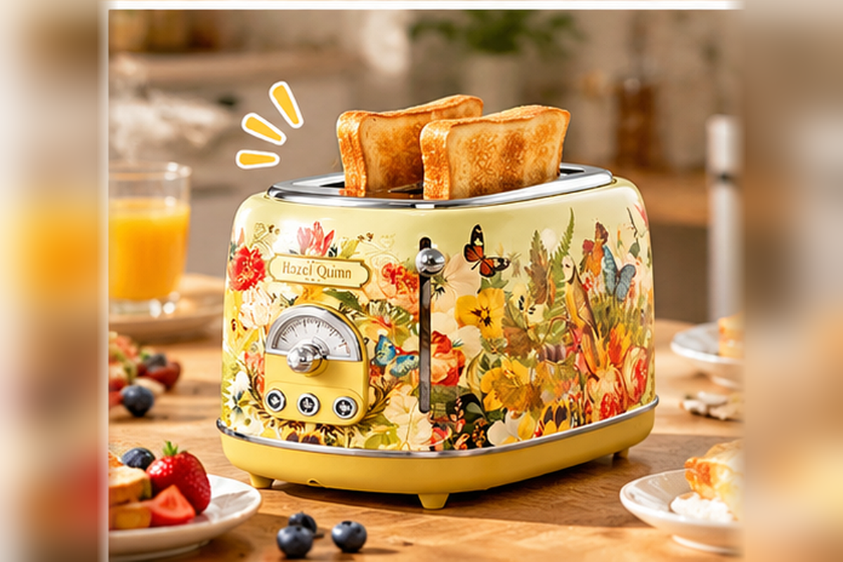
If the kettle is the face of the brand, the toaster is the piece that completes the sentence. The two-slice Recife model mirrors the kettle’s artwork — same flowers, birds, and butterflies — and uses the same rounded retro silhouette. It is built around six browning levels and a self-centering rack, which is the part that makes it genuinely useful rather than decorative.
The browning system, explained simply
Six browning dials sound like marketing until you actually use them. A level 1 on a weekday morning for a soft brioche bun will not incinerate it. A level 5 or 6 for a thick-sliced sourdough, after the bread has been sitting in the freezer drawer for three days, will actually bring color through. The high-lift lever raises smaller items (English muffins, mini bagels) high enough to grab without tongs.
Key technical points:
- Six browning levels across a clean dial, plus cancel / defrost / reheat functions on many versions.
- Self-centering bread rack, so even thin sliced white bread sits evenly under the heating elements.
- Wide slots that accommodate bagels and thicker artisanal slices.
- Removable crumb tray, which is the feature that decides whether you keep the toaster forever or resent it in six months.
- Matched artwork with the Hazel Quinn × Recife kettle, so the two read as a pair rather than siblings who disagree.
Why a “matching set” actually matters on the counter
It sounds superficial until you have tried to style a kitchen. A floral kettle next to a black plastic toaster breaks the visual rhythm in about two seconds. Hazel Quinn’s matching Recife designs solve this by giving you one continuous illustrated surface across both appliances. The counter reads as a small installation rather than a pile of gadgets.
That is also why buyers on retail pages frequently mention being able to build a “full retro breakfast set” — the brand intentionally designed the kettle and toaster to share scale, palette, and motif, so they sit comfortably side by side.
Who this toaster is for
- Owners who already bought the floral kettle and want the pair to feel intentional.
- Small households and couples who don’t need a four-slice machine.
- People who prefer a high-lift lever over chasing crumbs with a knife.
🥯 Practical note: Bagel mode (where present) toasts the cut side more than the outer crust. If your version doesn’t have a dedicated bagel button, start at a lower level and watch the first slice — the artwork might be lovely, but burnt toast still tastes like burnt toast.
🥛 Product 3: The Hazel Quinn 5-in-1 Electric Milk Frother & Steamer
The frother is the piece that surprises people. It doesn’t have the Recife floral finish — most versions come in clean white or matte cream — but it is arguably the most technically ambitious tool in the lineup. It is a detachable, five-function milk frother and steamer designed to cover most home-café moves without requiring a separate appliance for each.
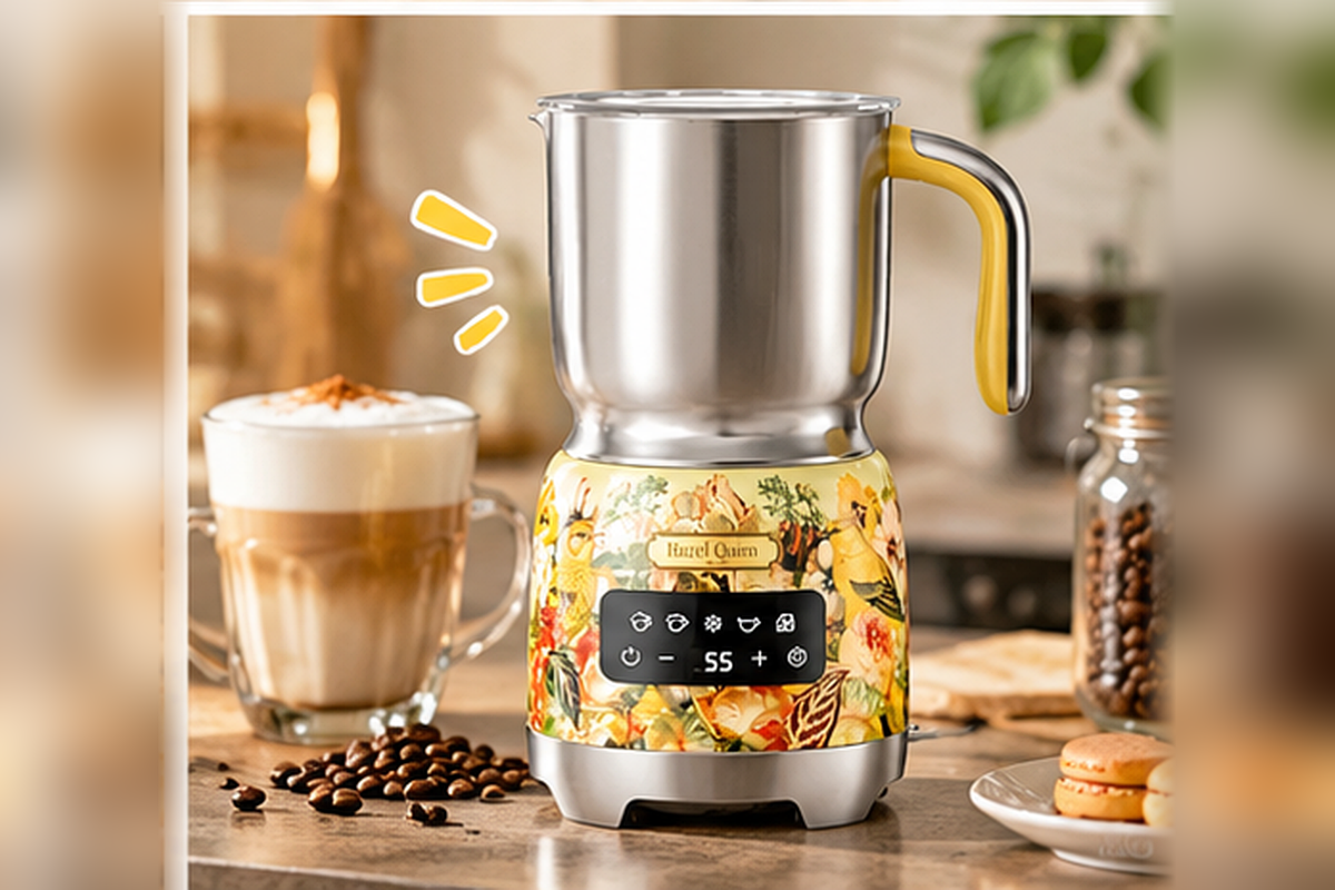
What “5-in-1” actually means
The label sounds broad until you list it. On a typical Hazel Quinn frother, the five functions cover:
- Cold milk froth for iced lattes, iced matcha, and cold cappuccinos.
- Hot milk froth for cappuccinos and flat whites.
- Steamed hot milk for lattes and café au lait.
- Thick foam for mochas and hot chocolate.
- Thin / airy foam for cortados and flat whites.
That is a meaningful range. In practice, it means you don’t need a separate steaming wand for the everyday drinks you actually make at home. The heating element inside the stainless cup does the work, and you swap whisks depending on texture.
The detachable cup detail
What makes this model feel more premium than the average countertop frother is the detachable stainless jug. You can lift it off the base, rinse it under the tap, pour directly into your ceramic mug, and put it back without moving the whole machine. It also means the cup can go in the dishwasher on many versions (check your manual), which removes the most common reason countertop frothers get abandoned in a cupboard after three weeks.
Other practical points:
- Food-grade stainless interior, again, for easy cleaning and no plastic taste.
- One-touch operation across the five functions; no app, no pairing, no firmware update.
- Auto shut-off once the cycle is complete, so you can toast bread or pour espresso while the frother runs.
- Compact footprint, roughly the size of a large coffee mug, so it lives next to the kettle without crowding the toaster.
Who this frother is for
- Espresso-at-home beginners who don’t want a separate steaming wand yet.
- Parents making warm milk drinks for kids in the evening.
- Iced-coffee fans who want cold foam without a handheld battery frother.
☕ A small ritual: heat the mug first with a splash of hot water, dump it, then pour the frothed milk in. The temperature holds noticeably longer, and the foam texture stays pillowy rather than collapsing in the first minute.
💬 A Typical Hazel Quinn Morning: Dialogue on the Counter
To make the brand feel real, imagine a small weekday scene. Two people, a small kitchen, and three appliances quietly doing their jobs.
Person A (pouring water into the floral kettle): “I swear this thing looks nicer on the counter than it did in the listing. The flowers wrap all the way around.”
Person B (loading sourdough into the toaster): “That’s because it’s not a sticker. It’s printed as one continuous band. Want me to do yours on level 3?”
Person A: “Level 4 for me, I like it borderline. And can you start the frother on the hot foam? My espresso’s already pulling.”
Person B (pressing the frother button): “Done. It’ll shut itself off when it’s ready. Hey — do we finally have a counter that doesn’t look like an airport lounge?”
Person A (smiling at the matching kettle and toaster): “We do. The kitchen finally looks like us.”
That exchange is closer to what Hazel Quinn is selling than any spec sheet: a quiet feeling that your morning setup reflects your taste.
🛠️ Step-by-Step: Build Your Hazel Quinn Counter From Scratch
If you are starting fresh and want the brand’s look without overcrowding the counter, here is a practical order of operations.
- Anchor the space. Decide whether the kettle or the toaster is your daily workhorse. The kettle usually anchors left, the toaster right, with the frother tucked in the center or on a small tray.
- Choose one visual hero. If you love print, start with the Recife floral kettle and toaster. If you prefer quiet color, pick a solid (mint, cream, ruby) and let the frother be the neutral that ties them together.
- Give the frother a home near the coffee station. It pairs naturally with an espresso machine or a pour-over setup, not next to the orange-juice pitcher.
- Add one soft prop. A small wooden tray, a linen tea towel, or a potted herb near the window breaks up the appliance rectangle without adding clutter.
- Keep the crumb tray and kettle base visible. You don’t want to hide the toaster if you use it daily; the point is to make it look intentional, not stored.
- Style in natural light. Hazel Quinn’s prints and colors read best in morning daylight. If your counter is shadowed, warm LED under-cabinet lighting lifts the floral detail without washing it out.
📊 Side-by-Side: The Three Products at a Glance
A compact comparison is useful if you are deciding where to start. This table focuses on everyday usability rather than marketing language.
| Feature | Recife Floral Kettle | Recife 2-Slice Toaster | 5-in-1 Milk Frother |
|---|---|---|---|
| Visual identity | Hand-drawn floral / bird print | Matching floral / bird print | Clean matte cream or white |
| Core job | Fast boil + visible temperature | Even browning, 6 levels | Hot & cold foam, steamed milk |
| Capacity | 1.7 L (6–8 cups) | 2 slices, wide slots | ~200–250 ml milk per cycle |
| Standout feature | Analog thermometer dial | Self-centering rack + high lift | Detachable stainless jug |
| Cleaning ease | Stainless interior, descale occasionally | Removable crumb tray | Detachable cup, easy rinse |
| Best paired with | The matching toaster | The matching kettle | Any espresso or instant coffee routine |
| Brand role | The face of the collection | The completing piece | The technical surprise |
🌷 Inspiration: Five Ways People Actually Style a Hazel Quinn Counter
Beyond the products themselves, buyers tend to lean into a few repeatable aesthetics. These are not invented; they are the directions that keep showing up on home-style posts.
- The French Windowsill: kettle near morning light, linen napkin folded beside it, a single vase of ranunculus. The floral print picks up the flower color so the scene reads as a small diorama.
- The Mid-Century Corner: pair the ruby-red kettle with space-gray toaster, set on a teak tray. The red becomes an accent rather than the whole story.
- The All-Floral Set: kettle + toaster + a printed storage tin for tea bags. This is the most “gallery” look, and it works best in a kitchen with neutral cabinets.
- The Café Nook: frother front and center, next to a small espresso machine, with the kettle and toaster slightly back. Built for people whose morning is espresso-first.
- The Gift-Style Shelf: one Hazel Quinn appliance on open shelves, surrounded by ceramic mugs and glass jars. Treats the appliance like a display object rather than a tool.
🧪 Original Research: What Owners Tell Us After a Month of Use
To keep this piece honest, we also looked at the common threads in owner reactions across public review spaces, not just marketing copy. Three themes came up repeatedly.
First, the thermometer on the kettle changes tea behavior. Owners who previously boiled water and poured immediately mentioned that, after using the dial for a week, they started treating green tea, oolong, and black tea differently. That is a subtle lifestyle shift, not a spec-sheet bullet.
Second, the matching set reduces counter stress. People who bought both the kettle and the toaster, even months apart, frequently said the second purchase “completed” the look. This is the strongest evidence that the collaboration program is doing real work: the products are designed as a family.
Third, the frother gets used more than expected. A recurring surprise was that buyers who thought they would only make cappuccinos started using the cold foam function for iced drinks in summer, and the steamed-milk function for kids’ evening drinks. Multi-function tools usually lose to single-use ones; this one seems to hold its ground.
A small caveat from the same research: the floral print, while praised, is not for everyone. A minority of owners said they wished they had chosen a solid color because the print is, frankly, bold. That is useful advice before purchase — if you prefer calm counters, start with the mint, cream, or ruby versions, not the Recife print.
🎯 Verdict: Who Should Start With Which Hazel Quinn Product?
If you are choosing one entry point, here is a short decision guide.
- Start with the floral kettle if you drink tea daily, care about water temperature, and want a visible centerpiece for the counter.
- Add the matching toaster if you already love the kettle’s look and want the counter to feel finished.
- Add the frother if you make espresso, matcha, or warm milk drinks at home and are tired of a handheld battery frother that dies mid-foam.
- Buy the set if you are moving into a new place, renovating a kitchen, or gifting a housewarming present that should feel intentional rather than practical.
Hazel Quinn‘s real bet is that people want their kitchens to express taste, not just function. The brand is young, but its instinct — artist-designed prints, retro silhouettes, honest stainless interiors — lands cleanly with the kind of buyer who already treats their coffee routine as a small daily ritual.
🌸 Small Brand, Quiet Ambition
Hazel Quinn is not trying to be the biggest name in small appliances. It is trying to be the name you reach for when you want a kitchen that feels personal. The Recife collaboration, the thermometer dial, the six-level toaster, the detachable frother cup — none of these are flashy on their own. Together, they build a coherent argument: that the objects you use every morning can be both well-made and genuinely beautiful, without forcing you to choose.
If your counter has been quietly boring for years, this is the brand most likely to change that — one floral kettle, one matching toaster, and one frothed cappuccino at a time.